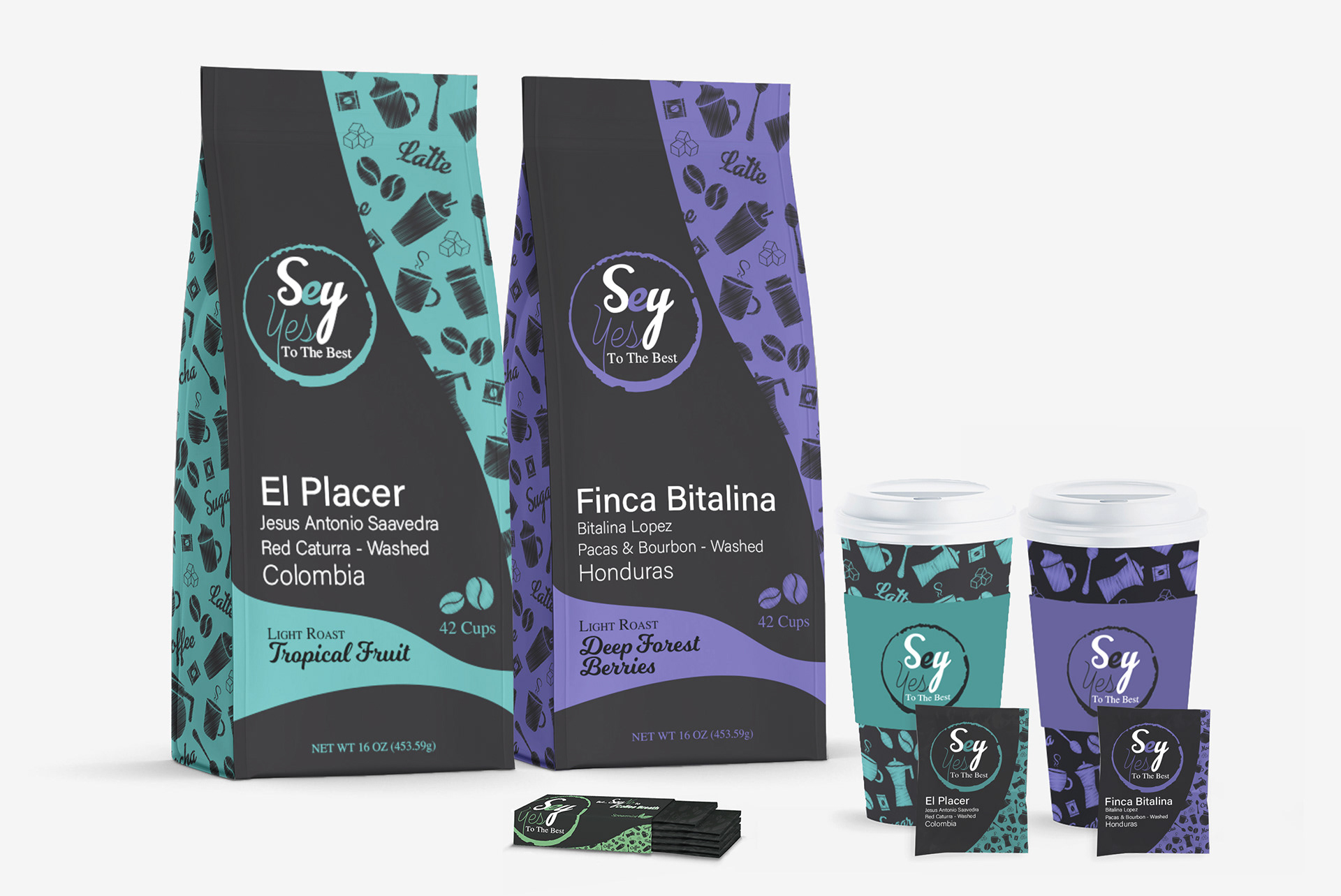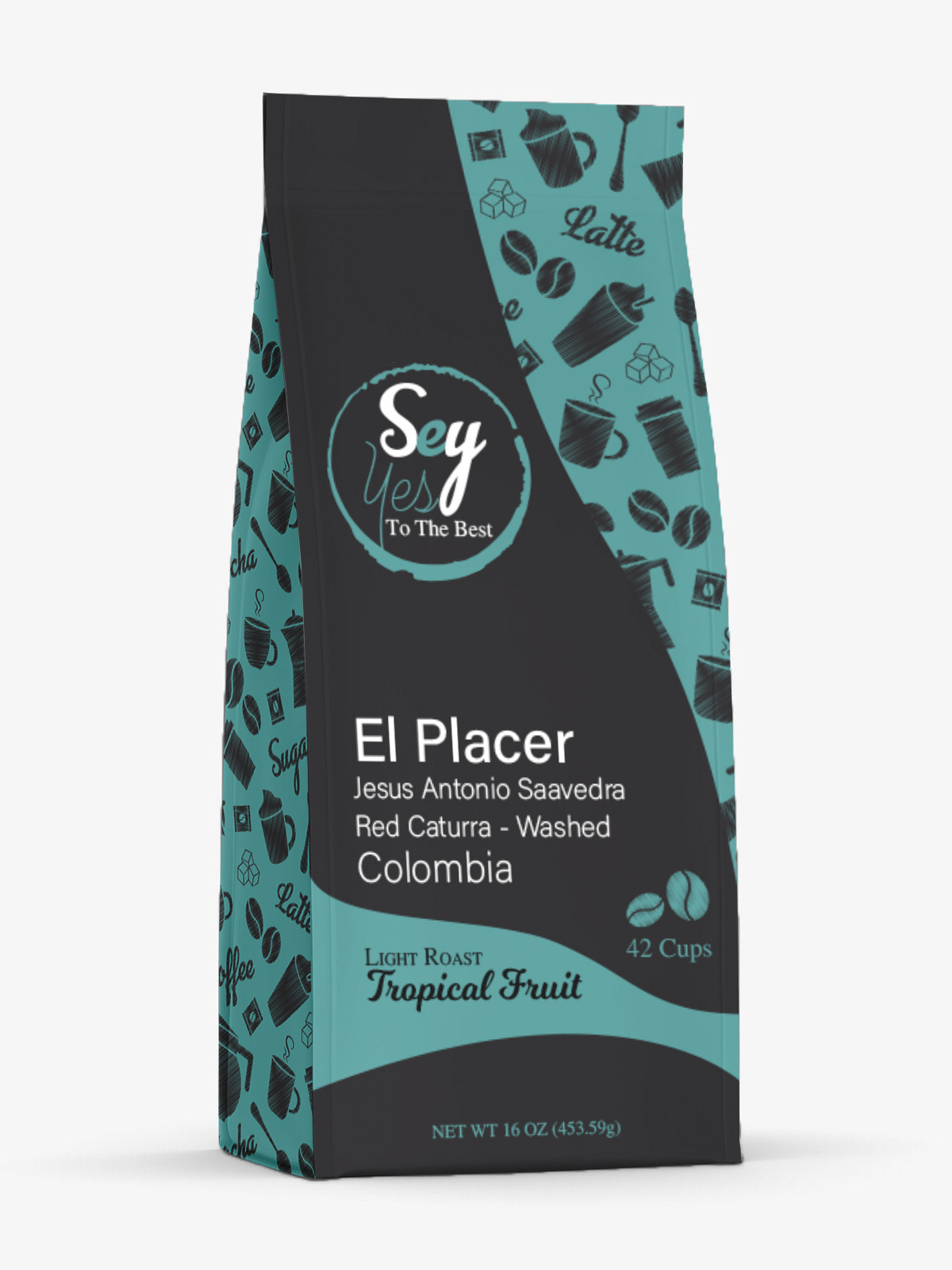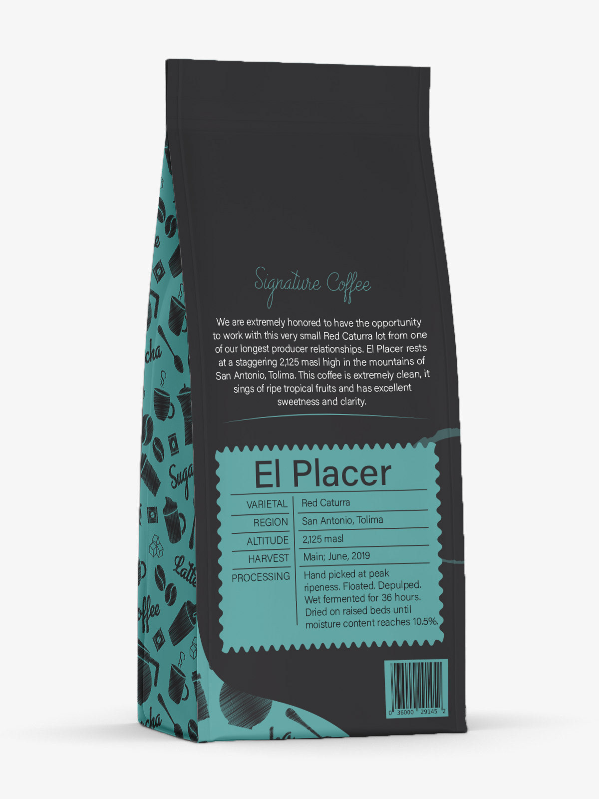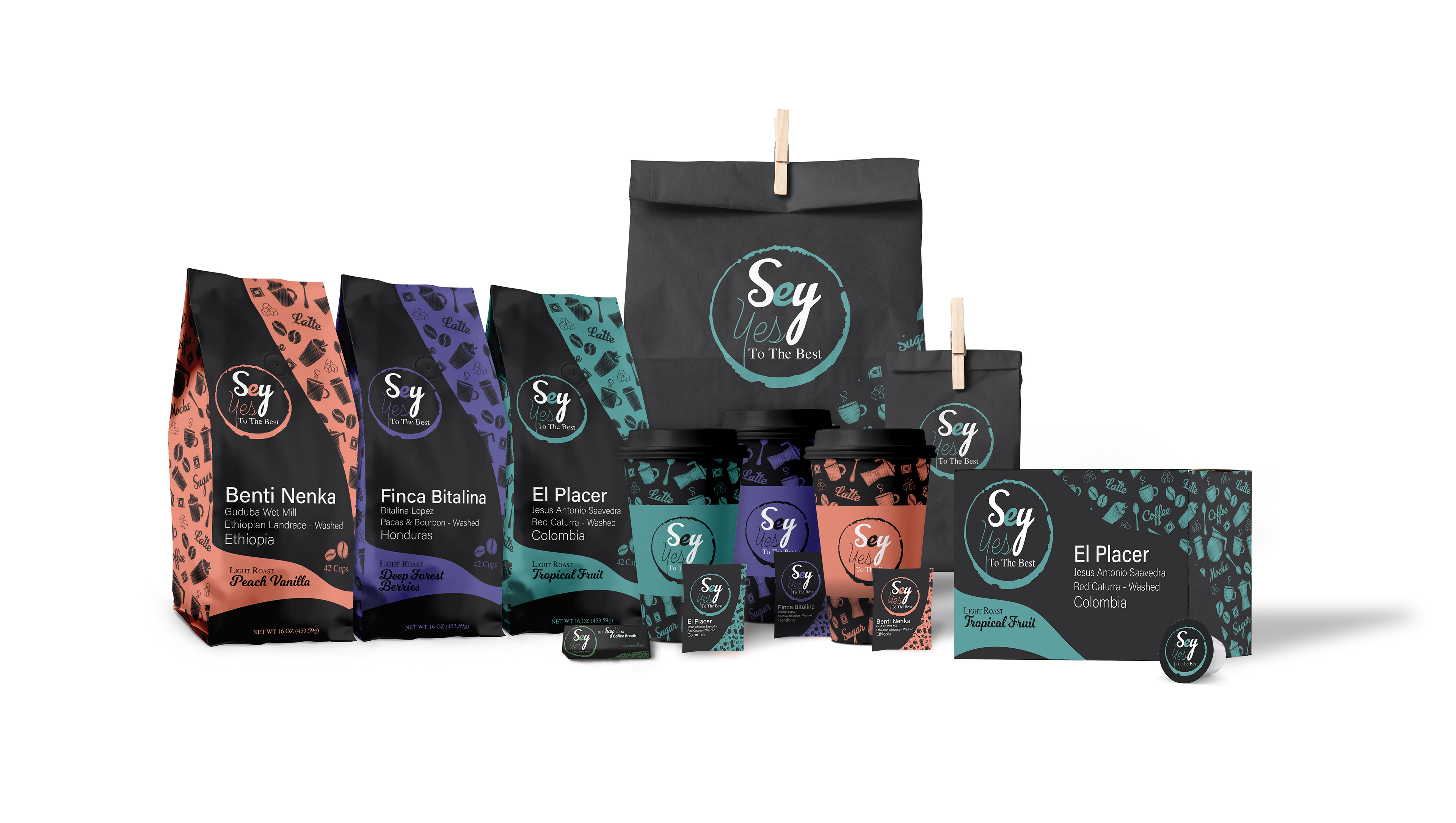
Brand Identity & Packaging
Sey is a contemporary micro-roastery based in Brooklyn, New York. The company harvests its coffee worldwide with a priority in delivering a selection of the finest and most dynamic coffees to its customers. The use of a single color for each package, in either a light or dark shade, indicates the coffee flavor. Different hues represent particular locations from which their coffees are produced and promote the quality of diversity embedded within their brand. The variety of colors remind consumers that there is a unique story behind each flavor and harvest point. The pattern, created with organic style coffee icons, shows a connection with nature and signifies that there are no boundaries when it comes to using only the best coffee for their product.